 ABHIJEET AMONKAR
ABHIJEET AMONKAR
ABHIJEET AMONKAR
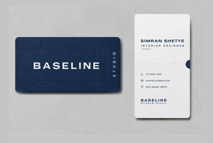
Baseline Studio needed an identity that reads like an interior designer’s own drafting table — precise, architectural, nothing decorative for its own sake. Designed the logo mark and wordmark first, then extended that same language into the stationery: crosshairs and ruled grid lines borrowed directly from floor plans and elevation drawings, embossed into a deep navy card stock so the design reveals itself in light and shadow rather than flat ink. Clean enough to hand to a client, specific enough to say exactly what the studio does before a word is read.